By Marcy Stamper
Photography by Sol Guttierez
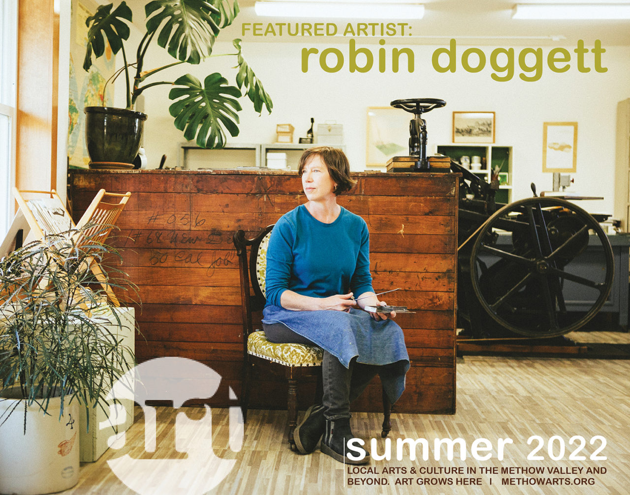
CLICK HERE TO VIEW FULL SUMMER MAGAZINE
Through different facets of printmaking, Robin Doggett has found a way to explore concepts of communication and modernity in an art practice that honors the beauty and elegance of paper, ink, and type.
Since she opened True North Letterpress three years ago, Doggett has combined her passion for letterpress printing – turning out cards, chapbooks, and paper ephemera on a 111-year-old press – with exquisite monoprints where she probes ideas about relationships, landscape, and community.
“My art feels so all over the map. I’m trying to satisfy two sides of my brain – letterpress printing, and more experimental art for art’s sake,” she said.
But those two aspects of her work nourish one another and share Doggett’s sophisticated aesthetics – white space that allows the beauty and texture of the paper to come through, type and geometric forms with lots of personality, and a refined color palette.
While that balance arises out of Doggett’s background in graphic design, printmaking, and hand bookbinding, pursuing both types of printmaking is simply a product of her nature, she said.
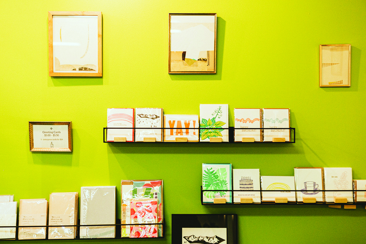
The cards, coasters, and handbound journals that Doggett designs and prints are deceptively simple. But they bring together expertly set type, meticulously mixed colors, and elegant papers and handwork.
Doggett’s cards feature birthday wishes or an inspirational statement like “You Shine” and include graphics like a cake, a sun, or a fern frond. Many include a touch of whimsy, like chickens or balloons.
Doggett loves the letterpress process – even though it can be temperamental – but she also prizes it for what she calls its “democratizing aspect.” The ability to make more than one version of something makes the art less precious, she said.
Sharing of images online has also broadened access to art. “Not everyone’s going to see your work in person on a gallery wall anymore,” she said. That has the salutary benefit of exposing more people to the beauty and variety of art, she said.
Universality of access is inherent in Doggett’s letterpress art. “What’s sweet about it is that a lot of people still send cards. It’s really encouraging – every day someone grabs a card and writes a sweet thing for somebody,” she said.
In an era of text messages and apps that produce disappearing messages, many people are drawn to hand-printed cards precisely because of their physical, palpable nature – the luscious piece of paper, where you can feel the letters – that make them worth saving. “That’s an attraction of greeting cards – they don’t have to live on the wall behind glass,” Doggett said.
The unique nature of letterpress, which uses three-dimensional type and graphics, means that the press leaves a subtle indentation in the paper. Not only does the paper have texture, but even the text has texture. It feels good to the hand in a way that modern printing simply can’t replicate, Doggett said.
‘Treasure hunt’
Doggett’s favorite part of her work is the actual printing on the press. It’s not creative – except for the intensive problem-solving it often requires – and not glamorous, she said, but every time she pulls a piece of paper off the press, she is experiencing the physical result of the entire process. It brings tremendous satisfaction, she said.
Even with experience, operating a century-old press involves considerable trial and error, Doggett said. The room temperature and humidity can affect the way the ink reacts.
“It’s not linear – the equipment is more than 100 years old. It takes time to understand how to get it to do what you want it to do,” she said. “It’s kind of like a treasure hunt. You know there’s an answer, but how long will it take to be revealed?”
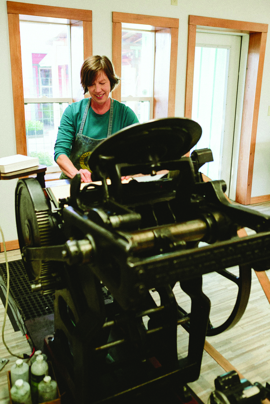
Doggett acquired the printing press when she was a partner in the local print studio Door No. 3. When she and her partner learned that the press was available, they jumped at the chance to aquire it, sight-unseen.
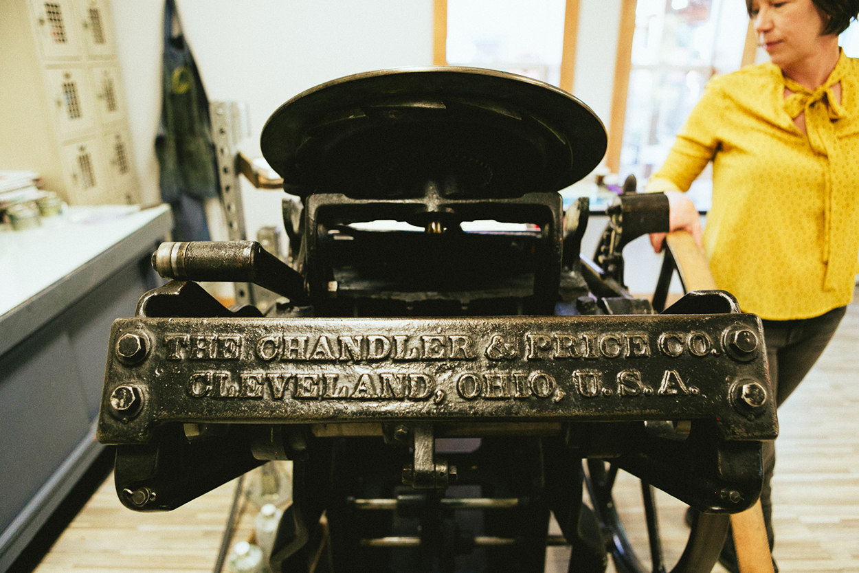
The press, built in Cleveland in 1911, had been well cared for. And these presses were built to last. “I just keep putting oil into it, and it just keeps working,” she said.
They dubbed the press Emmaline, after Emma Goldman, who lived during the same era. “Most cool machines have a personality,” Doggett said.
“What I love about printmaking and bookmaking is that I get to use cool tools. I love paper and ink. It’s so much about the process of figuring things out,” she said. “It’s also what I hate about it,” she admitted.
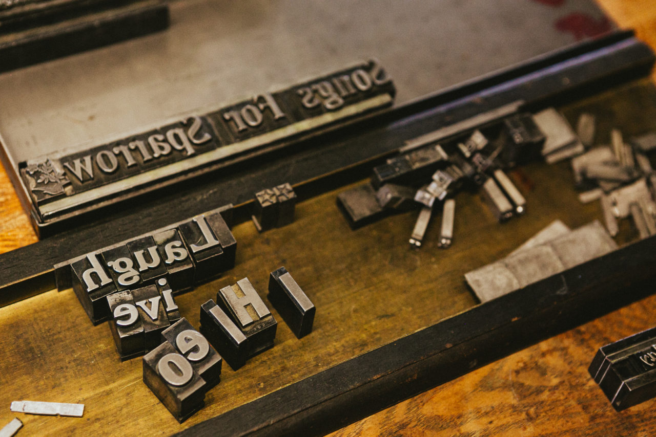
Doggett was fortunate to acquire wooden and metal type from newspapers in Chelan and Brewster. Because she’s using three-dimensional letters, she has to carefully fit them together – upside-down and in reverse – in a frame that holds them in place. “Type forms are super-intricate,” she said. “They’re hard to print well.”
A frame on the printing press holds the type or image in place as Doggett turns the press to distribute ink on the round plate. She fine-tunes the pressure and the punch of the type onto the paper by adding sheets of backing paper that vary in thickness by just by micrometers.
For years, Doggett used the original foot treadle to make each print, but she recently added a motor to print more efficiently.
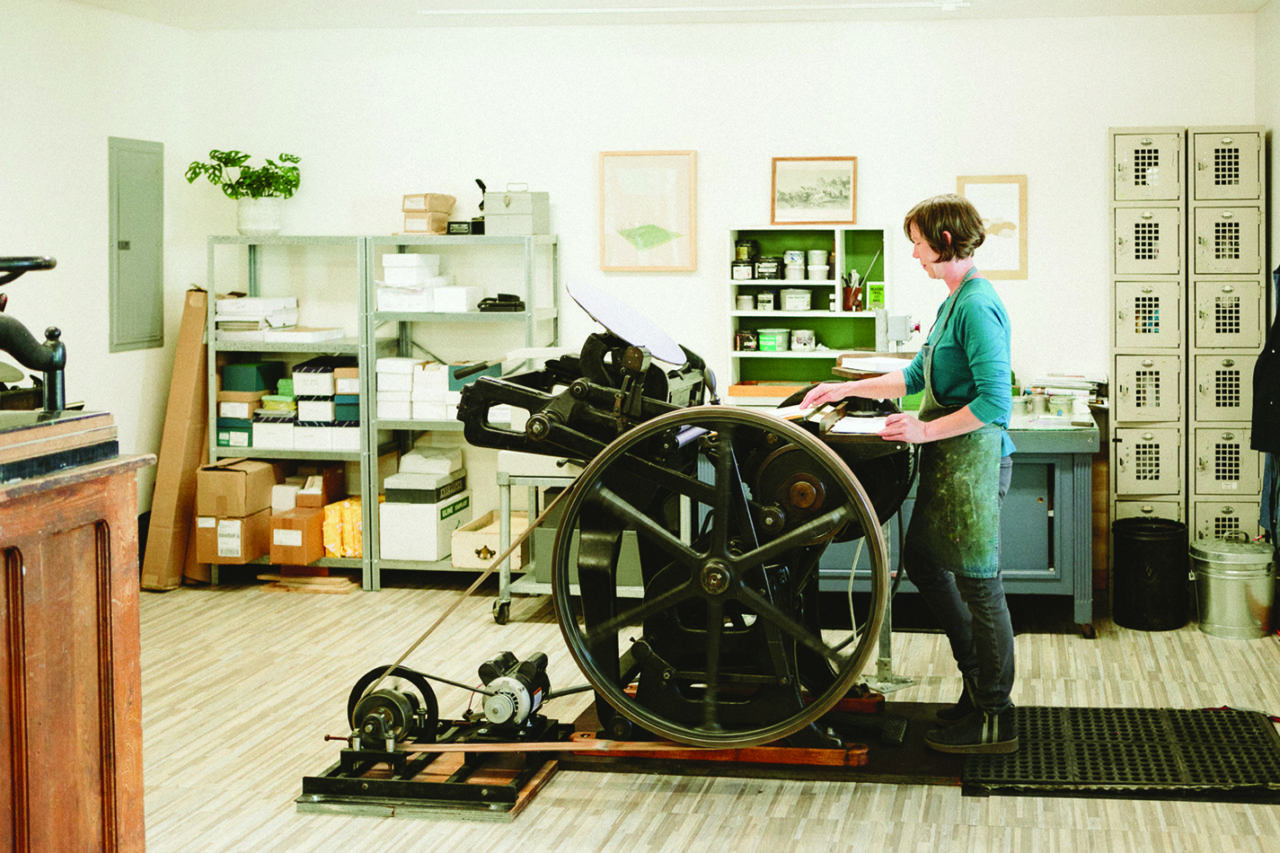
Doggett loves printing cards on Emmaline. “It’s totally direct. It meets my standards of a beautiful, modern designed object, but the process of making it is so rewarding and very hands-on,” she said.
In addition to designing and printing her own line of cards, Doggett prints cards, invitations, and other paper goods for clients. She also collaborates with other artists, doing printing for them or advising on various aspects of design, letterpress, and bookmaking.
Monotypes – inner landscapes
Doggett’s fine-art prints, mostly monoprints, are where she explores complex concepts and more personal subjects. Characterized by a lot of white space with overlapping, blocks of color and subtle gradations of texture, the prints are uncluttered and tranquil, but they’re anything but simple.
Most types of fine-art printing can produce multiple impressions of the same image. But to obtain the desired composition, color, and transparency for a monoprint means that you’re basically making a single print – sometimes with a handful of variations, Doggett said. The monoprints are printed on a different press that’s used for fine-art printing.
With her design background and embrace of the tactile qualities of printmaking, Doggett is drawn to geometric shapes and graceful compositions. The shapes represent an accumulation of experience, emotion, and perspective – a graphic expression of human interactions and the messiness of life, she said.
While some artists express themselves through gestures as they draw or paint, Doggett spends a lot of time thinking deeply about her subject and composition before she creates a piece.
“A lot of my work seems very simple, but it takes a lot of time to get into the right contemplative space. It’s complicated to be able to strip an image down to that level of simplicity,” Doggett said.
To Doggett, that’s part of the challenge of being an artist – taking something that has no physical representation and finding a way to visualize it. For one recent body of work, she started with studies in collage and mixed-media to explore the value we attach to our inner experiences. The sketches are a collection of curves, swirls and lines, with ragged shapes torn from paper.
Once she has a composition in mind, Doggett superimposes and manipulates layers of translucent ink on the printing plate. Most of her prints require eight or nine separate impressions to create the final print. The translucent quality of the ink – which she mixes herself – allows the beauty and surface of the paper to be an integral part of the finished print. Doggett typically floats her prints in a frame, without a matte, so that the edges of the paper are visible.
Doggett favors soft colors – pale blues, yellows, and greens. She mixes all her own inks, which gives her maximum control over the subtleties.
She sometimes thinks of her monoprints as “pseudo-landscapes,” with horizons and shapes that suggest mountains or fields and an expanse of sky. A landscape is the perfect visual metaphor for an inner journey and the emotional states that we navigate, as well as movement through time, she said. “A horizon line always represents what’s ahead,” she said.
The fact that her pieces are fairly abstract allows the colors to carry some of the emotion and encourages individual interpretation. “I want my art to feel expansive so that people can find their own meaning,” she said.
The process of making monoprints is refreshingly different from her letterpress work, where she needs to know in advance, down to a 32nd of an inch, what she’s going to create, she said. “I appreciate having my art practice as a counter to that. I feel really fortunate to have space where all of this can take place,” she said.
“A huge part of art-making is not specific. It just wants to live in an ephemeral, in-between, uncertain subject matter,” she said. “It’s so human, because it’s not clearly defined.”
CLICK HERE TO VIEW FULL SUMMER MAGAZINE
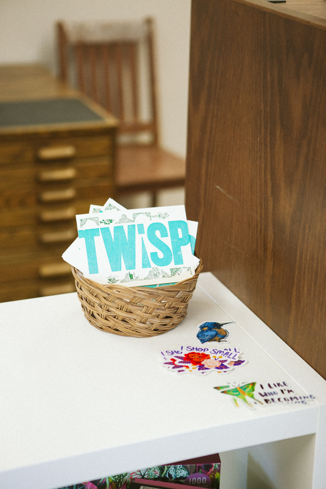
True North Letterpress is across from the Twisp Commons Park. Visit Robin Doggett there weekdays 10am-4pm and Saturdays 9am-2pm. A solo exhibit for Robin Doggett is on display at Methow Arts, June-mid-July. Find out more about Robin at truenorthletterpress.com.
